How to make your WordPress site accessible
Imagine spending thousands on a new physical storefront, only to build a 5-foot wall directly in front of the entrance. It sounds unthinkable, yet over 95% of the internet’s top websites are doing the digital equivalent.
That’s what a lack of accessibility is. For a long time, I saw this as a technical compliance checklist. However, that is a very wrong way of looking at things. Figuring out how to make your WordPress site accessible isn’t a niche technical task but a fundamental, human-centered design choice. It’s also a massive business opportunity, a legal necessity, and a core part of good SEO.
The good news is that it’s more achievable than you think. You don’t need to be a specialist to make a massive impact, but you do need a plan. I’ll walk you through a practical plan, from the foundational steps to the small, everyday habits that keep your site usable for everyone. Let’s build a WordPress experience that genuinely includes all users.
Key takeaways
Section titled Key takeaways- Accessibility is about people, this means designing your site so people with disabilities can use it.
- It’s not just “nice to have” as it directly impacts your SEO, improves the user experience for all your visitors, and has growing legal implications (ADA, WCAG).
- Content plays a major role. How you structure headings, add alt text to images, and ensure color contrast matters just as much as your theme choice.
What is web accessibility (A11y) and why does it matter?
Section titled What is web accessibility (A11y) and why does it matter?Before I jump into the ‘how’, let’s understand the ‘what’ and ‘why.’
I used to get lost in this technical jargon of WCAG (Web Content Accessibility Guidelines), ADA and compliance levels. But I’ve learned to think of it this way:
Imagine you own a physical shop. You’d never build a store with only stairs and no ramp, right? You wouldn’t want to exclude customers in wheelchairs. You’d make sure your signs were large and clear. A website is no different. It’s your digital storefront, and leaving accessibility out is like putting a “Closed” sign on the door for millions of people. Let me break the scary technical terms down, so you know what to look out for when auditing your site.
WCAG – Web Content Accessibility Guidelines
Section titled WCAG – Web Content Accessibility GuidelinesThe Web Content Accessibility Guidelines are the gold standard. Think of them as the building code. They are organized into three levels: A (bare minimum), AA (the global standard most laws require), and AAA (specialized). Your goal as a site owner is generally at least WCAG 2.1 Level AA. This ensures your content is Perceivable, Operable, Understandable, and Robust (POUR):
- Perceivable: Users must be able to consume your content in different ways – whether seeing it, hearing it, or using touch.
- Operable: Your site must function without a mouse. Users need to be able to navigate every menu and button using just a keyboard or voice commands.
- Understandable: Content should be clear and predictable. Avoid jargon, confusing layouts, or complex instructions.
- Robust: Your underlying code (HTML/CSS) must be clean and standard-compliant so it works reliably with assistive technologies like screen readers.
ARIA – Accessible Rich Internet Applications
Section titled ARIA – Accessible Rich Internet Applications(WAI-ARIA) is a set of special code attributes you can add to HTML. Think of ARIA as a ‘bridge’ for complex features. Standard HTML (like a <button>) is already accessible. But if you build a complex custom slider or a pop-up window, screen readers might not understand it. You use ARIA labels to tell the screen reader, “Hey, this is a slider, and its value is 50%.”
ADA – Americans with Disabilities Act
Section titled ADA – Americans with Disabilities ActThe Americans with Disabilities Act (ADA) is a US civil rights law prohibiting discrimination against individuals with disabilities. While it was written in 1990 with physical spaces in mind (think wheelchair ramps and accessible restrooms), courts and the Department of Justice have increasingly interpreted websites as “places of public accommodation” under Title III. This means that if your digital storefront blocks users with disabilities, for example, by not working with screen readers – you are potentially violating US federal law. Being ADA compliant effectively means ensuring your site meets the technical standards of WCAG.
A11y
Section titled A11yA11y is a numeronym (11 letters between ‘a’ and ‘y’). It’s the practice of making sure your website can be used by everyone. This includes people who:
- Are blind and use screen readers
- Have low vision and need to zoom in or use high-contrast modes
- Have motor disabilities and can’t use a mouse
- Are deaf or hard of hearing and need transcripts or captions for audio/video
- Have cognitive disabilities and benefit from clear, simple layouts and predictable navigation
Make better websites for everyone
Section titled Make better websites for everyoneApart from direct implications towards individuals with accessibility needs, making your site accessible has powerful “side effects” that also benefit you as a site owner:
- Better SEO: Google and other search engines want to rank content that is usable by everyone. Guess what? The things screen readers use to understand your site like proper heading structures (H1, H2, H3), alt text on images, and descriptive links, are the exact same things Google’s crawler uses. A+ accessibility is A+ technical SEO.
- Improved User Experience (UX): A site that’s accessible is, by definition, a site that’s easy to use. Clear fonts, good color contrast, and logical navigation make your site better for everyone, including a user on a mobile phone in bright sunlight or someone who’s just tired.
- Legal Protection: This is the one that gets people’s attention. In many countries, website accessibility is a legal requirement. Lawsuits regarding non-accessible websites are increasingly common. Building an accessible site isn’t just good practice; it’s smart protection.
Accessibility isn’t a constraint. It’s a good design.
Your 10-step WordPress accessibility checklist
Section titled Your 10-step WordPress accessibility checklistYou don’t have to do all of this in one day. But here are the core steps to focus on.
1. Choosing an accessible theme
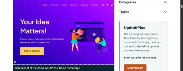
Section titled 1. Choosing an accessible themeThis is step one for a reason. You can’t build an accessible house on a broken foundation. I cover this in depth in my article comparing most accessible WordPress themes. If you’re starting a new site, pick one from that list. If you have an existing site, see how it stacks up or plan a theme switch.
Don’t make changes without a safety net
Before you start your accessibility remediation, always back up your site. A single conflict or code change could bring your entire site down. UpdraftPlus is the world’s most trusted WordPress backup plugin. One click, and your entire site is safe.
2. Using headings correctly
Section titled 2. Using headings correctlyDon’t use headings just to make text big and bold. Headings create a logical outline for your page. Screen readers use this outline to navigate. You should have one H1 as your page title and then a logical structure of H2s and H3s.
Recommendations
- Use a single H1 on each page
- Follow heading order logically (H2 → H3 → H4)
- Use
<nav>,<main>,<footer>,<aside>landmarks - Use
<button>for actions and<a>for navigation - Use ordered/unordered lists instead of line breaks
3. Make all images & media accessible
Section titled 3. Make all images & media accessibleWhen you upload an image to WordPress, it gives you an ‘Alternative Text’ field. Fill it out. A screen reader reads this text aloud. If the image is purely decorative, leave it blank, but if it conveys information (like an infographic or a photo of a product), describe it clearly. For video/audio make sure to add transcripts and/or subtitles. Avoid autoplay, as that might be startling to some users.
4. Color contrast
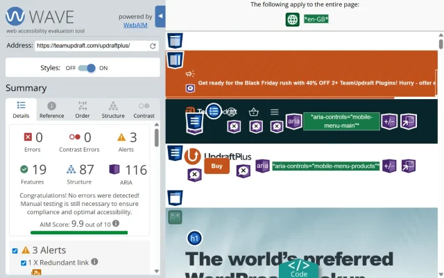
Section titled 4. Color contrastThis is a big one. Your text color needs to have enough contrast against its background color. Faint grey text on a white background might look “minimal,” but it’s unreadable for people with low vision. Use a tool like the WAVE Web Accessibility Evaluation Tool to check your contrast.
Recommendations
- Normal text: 4.5:1
- Large text (18px+): 3:1
UI components (buttons, icons): 3:1
Adjusting contrast often improves your entire design’s clarity.
5. Keyboard navigation
Section titled 5. Keyboard navigationTry this right now: go to your site’s homepage and hit the ‘Tab’ key. Can you see a visible ‘focus’ box move logically from link to link? Can you navigate your entire menu and click links just using your keyboard? If not, you have a problem. In some cases, themes handle this for you, however, always test and make sure your site is keyboard navigation friendly, regardless of what the theme promises.
6. Readable fonts and typography
Section titled 6. Readable fonts and typographyAvoid super-thin or overly “fancy” script fonts for your main body text. Use a reasonable font size (16px is a good minimum) and make sure your line spacing is generous. This helps users with dyslexia and cognitive disabilities.
Recommendations
- Minimum font size: 16px
- Line height: 1.5
- Paragraph spacing: 1em
- Chunk content into short paragraphs
- Avoid fully-justified text
- Use a readable typeface
- Avoid tiny caps or thin fonts
- Give headings enough whitespace
7. Links and forms
Section titled 7. Links and formsYour links should make sense out of context. Instead of “Click Here,” use descriptive text like “Read our 10 accessibility tips.”
For forms, make sure every field (Name, Email) has a visible label. Forms are often the worst offenders, so give them extra care:
Recommendations
- Label every field
- Avoid placeholder-only forms
- Use descriptive error messages
- Keep errors near the relevant field
- Ensure keyboard access
- Ensure focus moves to validation errors
- Enable autocomplete
8. Dynamic elements
Section titled 8. Dynamic elementsModals, sliders, mega menus, accordions, they all look cool but often break accessibility.
Recommendations:
- Popups should announce themselves
- Focus should move to the popup
- Escape should close the popup
- Focus should return to the triggering element
- Carousels should pause on interaction
- Content shouldn’t move unpredictably
Don’t avoid dynamic UI entirely, but build it responsibly.
9. Mobile accessibility
Section titled 9. Mobile accessibilityMost users are mobile-first. Your interface needs to be responsive and look and form as intended in all screen formats. Often, buttons and media lose control when the website is not responsively built.
Recommendations
- Check if the buttons large enough
- Touch targets 44×44px minimum
- No hover-only interactions
- High contrast on small screens
- Nav menus accessible by screen-reader
- Avoid parallax and auto-scrolling animations
10. Ongoing maintenance & backups
Section titled 10. Ongoing maintenance & backupsAccessibility is not a one-and-done project. One day you will log into your website and realise that the themes and plug-ins have updates and gone haywire.
Recommendations
- Audit regularly (use Lighthouse, WAVE, manual checks)
- Fix issues proactively
- Backup your site before every major change
This is where UpdraftPlus comes in handy. I always take a backup before updating plugins or switching layouts because accessibility can regress unintentionally.
Protect your work
When you’ve done the hard work of making your site accessible, the last thing you want is a plugin update breaking it. Back up your site with UpdraftPlus so you can restore your fully accessible version anytime.
Your accessibility toolkit: essential plugins and tools
Section titled Your accessibility toolkit: essential plugins and toolsA lot of the work is manual, but some tools can help you in optimizing and making your website better.
1. WP Accessibility
Section titled 1. WP Accessibility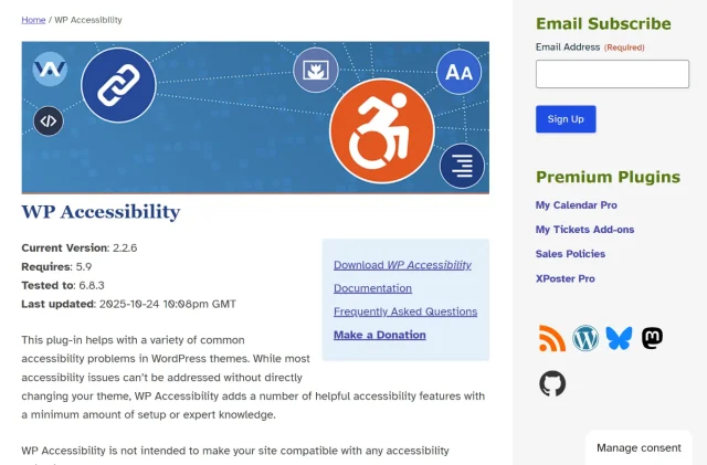
This free plugin by Joe Dolson is a classic. It fixes a lot of common WordPress issues that your theme might have missed. It can add “skip to content” links, add focus outlines, enforce alt text, and much more.
2. Block editor
Section titled 2. Block editorThe modern WordPress block editor (Gutenberg) has accessibility built-in. When you pick a text color and a background color, it will warn you if the contrast is too low. So, listen to it!
3. WAVE (Browser extension)
Section titled 3. WAVE (Browser extension)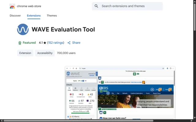
I’m listing WAVE again because it’s your #1 testing tool. Use it on every new page you publish before it goes live.
4. Axe DevTools (Browser extension)
Section titled 4. Axe DevTools (Browser extension)
Axe DevTools is the best tool for a more technical, developer-level audit.
5. Rev.com captions service
Section titled 5. Rev.com captions service
If you host video or audio, you must provide captions and/or transcripts. It’s non-negotiable. Services like Rev are fast, cheap, and human-powered for high accuracy.
Conclusion
Section titled ConclusionAccessibility isn’t about perfection. It’s about progress by making small, thoughtful improvements that ensure more people can benefit from the work you’ve put into your site.
Start small by running that automated scan today. Fix your color contrast tomorrow. Next week, tackle your navigation menu.
However, there is one golden rule before you start tinkering. Remediating a site means changing things – updating themes, installing new accessibility plugins, and tweaking code. In WordPress, these changes always carry a tiny risk of breaking your layout or causing conflicts. That’s why I never start an audit without a safety net. Before you touch a single setting, run a full backup with a reliable tool like UpdraftPlus. It takes just one click to secure your current setup, giving you the freedom and confidence to make those important accessibility improvements without the fear of breaking your site.
Every single fix you make removes a barrier for a real person. You’re helping build a more inclusive, accessible web one step at a time.
FAQs
Section titled FAQsWhat does it mean to make a WordPress site accessible?
Making a WordPress site accessible means ensuring people of all abilities can use and navigate your website. This includes users who rely on screen readers, keyboard navigation, assistive tools, or who have visual, auditory, motor, or cognitive disabilities. Accessibility focuses on clear structure, readable content, strong contrast, proper HTML markup, and inclusive design practices.
Is WordPress automatically accessible, or do I need to make changes?
WordPress provides a good foundation, but your site is only as accessible as the theme, plugins, layout, and content you create. You need to implement accessibility practices like alt text, proper headings, keyboard navigation checks, and color contrast improvements to ensure full accessibility.
How do I test my WordPress site for accessibility issues?
You can use tools like WAVE, Lighthouse, and Axe for automated tests, along with manual methods such as keyboard-only navigation and screen reader checks. Reviewing headings, alt text, forms, and contrast manually is crucial because automated tools can miss contextual issues.
What are the most common accessibility mistakes on WordPress websites?
The most frequent issues include low color contrast, missing alt text, inaccessible forms, lack of focus states, keyboard traps, unclear link text, autoplaying media, poor heading structure, and pop-ups that don’t work well with screen readers.
How often should I review or audit my site for accessibility problems?
It’s best to audit your site at least once every quarter and after major theme or plugin updates. Accessibility can break without you noticing, especially when a plugin changes markup or introduces new interactive elements.
How do I make images and videos accessible on my site?
Add descriptive alt text to meaningful images (and empty alt text for decorative ones). For videos, provide captions, transcripts, and avoid autoplay. For audio content, offer a text transcript. This ensures screen reader users and people with hearing difficulties can access your content.
Can plugins affect website accessibility?
Yes, plugins can significantly impact accessibility, both positively or negatively. Some plugins add accessible forms or navigation enhancements, while others introduce inaccessible sliders, pop-ups, or animations. Always test plugin behavior with keyboard navigation and screen readers, and make backups before installing new tools.
What is the most accessible WordPress theme?
There isn’t a single “most accessible” theme for every website, but themes labeled accessibility-ready in the WordPress directory tend to follow strong accessibility coding standards. When choosing a theme, look for features such as keyboard-friendly navigation, visible focus states, semantic HTML structure, ARIA support, skip-to-content links, and good default color contrast. Always test the theme yourself, because accessibility also depends on how you configure and design your site.
About the author

Elvira Mishra
Elvira has over four years of experience creating and designing content in WordPress. Her background spans multiple digital disciplines, including marketing, SEO, user experience, and human computer interaction.
Categories
UpdraftPlus
Get all our premium features. Direct site-to-site migration, incremental backups, back up automatically before updates and a whole lot more.
From just $70 for the year.
More stories
-
How to secure a WordPress site (without overcomplicating it)
Learn how to secure your WordPress site with simple steps that protect against attacks, strengthen logins, and keep your data safe.
-
10 best WordPress themes for beauty salons
Here are the best options to help you stand out, look professional, and turn visitors into bookings.
-
Best Google Analytics alternatives for WordPress
Discover the best Google Analytics alternatives for WordPress, including privacy-friendly tools with simpler dashboards and better performance.
-
Best WordPress themes for artists and creative portfolios
Discover the best WordPress themes for artists to showcase portfolios and display artwork beautifully.