5 WordPress Web Design Tips to Improve Your Website

A few small design problems can make an otherwise great WordPress website feel harder to use than it should. Maybe the homepage feels a little cluttered, the fonts and colours don’t quite work together or everything looks great on your laptop but falls apart when you open it on your phone.
It’s easy to assume that fixing these problems means redesigning your entire website. Fortunately, that’s rarely the case.
Some of the most effective WordPress web design improvements are surprisingly simple. Cleaning up a busy layout, making your styling more consistent or rethinking your navigation can make a noticeable difference without changing your theme or rebuilding your pages from scratch.
Good web design is about more than making your website look attractive, too. The way your site is designed affects how easily visitors can find information, navigate between pages, read your content and take the actions you want them to take. Performance matters as well. Even a beautifully designed page can create a poor experience if visitors have to wait for it to load.
In this guide, we’ll walk through five easy WordPress web design tips you can use to improve your site fast. We’ll cover everything from simplifying your layout and creating a more consistent visual style to improving mobile usability, navigation and performance.
You don’t need to be a professional web designer to put them into practice, either. These are practical changes you can start making to your WordPress site today.
Key takeaways
Section titled Key takeaways- You don’t need a complete redesign to make a noticeable improvement to your WordPress website
- Simplifying busy pages and adding more whitespace can make content easier to read and important elements easier to spot
- Using consistent fonts, colours, buttons and spacing can make your website look more polished and professional
- Designing with mobile visitors in mind can prevent usability problems that aren’t obvious when working on a desktop
- Simple navigation helps visitors find important information without having to hunt through complicated menus
- Website performance is an important part of web design, as slow pages can undermine an otherwise great user experience
- Small, focused improvements are often easier to implement and maintain than trying to redesign everything at once
1. Simplify your layout
Section titled 1. Simplify your layout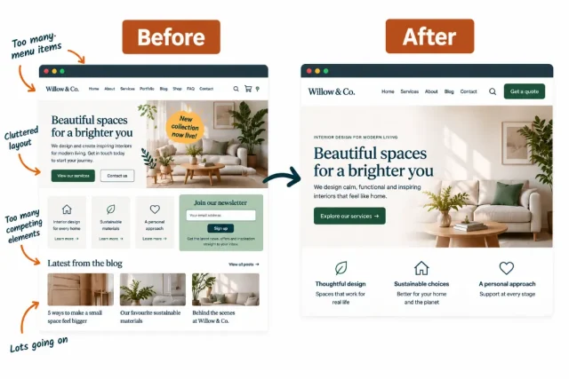
When you’re designing a website, it’s tempting to keep adding things. Another button here, another image there, a new section to promote an offer and perhaps a pop-up to make sure nobody misses your newsletter.
Before long, visitors are being asked to look at everything at once.
One of the easiest ways to improve your WordPress web design is actually to remove things. A simpler layout gives your most important content more room to stand out and makes it easier for visitors to understand what they should do next.
This doesn’t mean your website needs to be minimalist. You can still use bold colours, images, illustrations and creative layouts. The goal is to make sure every element on the page has a purpose.
Give your content room to breathe
Section titled Give your content room to breatheWhitespace is the empty space around text, images, buttons and other elements on a page. Despite the name, it doesn’t actually have to be white. It simply gives individual elements some breathing room.
Without enough whitespace, headings can blend into paragraphs, buttons can compete with each other and separate sections can feel like one enormous block of content.
Look at one of your most important pages and pay attention to the spacing between:
- Headings and paragraphs
- Individual sections
- Images and surrounding text
- Buttons and other interactive elements
- Columns, cards and content boxes
If everything feels tightly packed together, increasing the spacing can make the page feel cleaner almost immediately.
You can often adjust margins, padding and block spacing directly within the WordPress editor. If you’re using a block theme, you may also be able to control spacing across your website using global styles rather than editing every page individually.
Create a clear visual hierarchy
Section titled Create a clear visual hierarchyA good layout should help visitors understand what matters most before they have even read every word.
This is known as visual hierarchy. You create it by making important elements more prominent than supporting information.
Your page title, for example, should usually be more visually prominent than an H2. An H2 should stand out more than an H3 and your headings should be easy to distinguish from regular paragraph text.
The same principle applies to buttons and calls to action. If every button is large, brightly coloured and competing for attention, none of them feels particularly important.
Instead, decide what the primary action on each page should be.
On a product page, that might be buying the product. On a blog post, it could be reading another useful guide. On a service website, it might be requesting a quote or booking a consultation.
You can then make that action visually prominent while giving secondary actions a less dominant design.
Remove elements that are not helping
Section titled Remove elements that are not helpingYou don’t need to delete half your website, but it is worth questioning whether every element deserves its place.
Go through an important page and ask what each section is doing for the visitor.
You might find:
- Multiple calls to action asking visitors to do the same thing
- Large images that add little useful information
- Old promotional banners that are no longer relevant
- Widgets nobody really needs
- Long introductions that could be shortened
- Repeated information appearing in several sections
- Sidebars packed with links, adverts or other distractions
Removing even a few unnecessary elements can make the important parts of the page much easier to notice.
Think about a homepage with a hero banner containing three buttons, followed immediately by a newsletter sign-up, a promotion and several product cards. A new visitor has to decide between multiple actions before they have really understood what the website offers.
A simpler version might introduce what the business does, provide one clear primary action and then guide the visitor towards additional information as they move down the page.
Make every section earn its place
Section titled Make every section earn its placeOnce you’ve simplified the individual elements, zoom out and look at the page as a whole.
There should be a logical journey from the top of the page to the bottom.
For example, a simple service page might follow this order:
- Explain what the service is and who it is for
- Show the main benefit
- Explain how it works
- Provide evidence such as testimonials or results
- Answer common questions
- Finish with a clear call to action
That structure makes it easier for someone to scan the page and understand the story you’re trying to tell.
You can apply the same thinking to blog posts, product pages, landing pages and your homepage. Rather than asking where you can fit another element, ask what information the visitor needs next.
Check your WordPress theme too
Section titled Check your WordPress theme tooSometimes a cluttered website isn’t entirely down to the content you’ve added. Your theme controls much of the underlying appearance and layout of your WordPress site.
If you constantly find yourself fighting against your theme to achieve a clean design, it may be worth reconsidering whether it’s still the right choice for your website. If you decide to switch, make sure you know how to safely change your WordPress theme without affecting your live site.
Look for a theme that gives you control over important design elements such as typography, colours, layouts and spacing without adding unnecessary visual clutter.
If you’re considering a change, our guide to the best WordPress themes covers some popular options and what to consider when choosing one.
You don’t necessarily need to switch themes to make your current website look better, though. Start by simplifying one important page and see how much difference you can make with the design you already have.
2. Make your colours and fonts consistent
Section titled 2. Make your colours and fonts consistentYou don’t need an elaborate brand identity to make your website look polished. Simply using the same colours, fonts and styles consistently can make a big difference.
Problems often creep in as a WordPress site grows. You create a new landing page and choose a slightly different button colour. Someone adds a heading at a different size. A new plugin introduces its own styling. Eventually, individual pages might look fine on their own but the website as a whole starts to feel disconnected.
Creating a few simple design rules can prevent this and you don’t need to be a designer to do it.
Keep your colour palette simple
Section titled Keep your colour palette simpleStart by looking at how many colours your website currently uses.
You might have your main brand colour, several slightly different shades of it, multiple button colours and different background colours scattered across your pages.
Try narrowing these down to a small, reusable palette.
A basic website colour palette might include:
- One primary brand colour for important elements
- One secondary or accent colour
- A dark colour for headings and body text
- A light neutral colour for backgrounds
- White or another contrasting background colour
You can still use additional colours where they serve a purpose, such as success or error messages. The important thing is that colours have a reason for being there rather than changing from page to page.
Your primary CTA is a good example.
If the main button is green on your homepage, blue on your product page and orange on your contact page, visitors lose that visual consistency. Keeping your primary actions styled in the same way makes your interface easier to recognise and your website feel more cohesive.
Contrast matters too. A colour combination might look attractive but still make text difficult to read.
The Web Content Accessibility Guidelines recommend minimum contrast ratios for text, so it’s worth checking your colour combinations rather than judging them by eye alone. You can use a contrast checker when creating or updating your website palette.
Choose fonts that are easy to read
Section titled Choose fonts that are easy to readTypography has a huge influence on how a website feels.
A decorative font might look great in a logo or occasional heading, but it can become tiring when used across paragraphs of text. For most websites, readability should come first.
You usually don’t need lots of different fonts. One font family can work perfectly well across an entire website by using different sizes and weights. Alternatively, you might use one font for headings and another for body copy.
Whichever approach you choose, keep it consistent.
Your typography system could define styles for:
- Page titles
- H2 headings
- H3 headings
- Body copy
- Buttons
- Captions and supporting text
You should also consider line height and the width of your text. Long lines stretching across a large desktop monitor can be surprisingly difficult to read, even when the font itself is perfectly legible.
Keeping paragraphs at a comfortable width and adding enough space between lines can make longer pages much easier to scan.
Use consistent styles across your site
Section titled Use consistent styles across your siteColours and typography are only part of the picture.
Look at other design elements that appear repeatedly across your WordPress site. Buttons, forms, cards, images and content boxes should feel like they belong to the same design system.
For example, if your buttons normally have rounded corners, you probably don’t want square buttons appearing unexpectedly on another page. If blog images normally have gently rounded corners, using a completely different treatment halfway through the site can feel accidental.
Consistency is particularly useful for interactive elements. Visitors quickly learn what a button or link looks like on your website. Keeping those patterns predictable makes the site easier to use.
You don’t have to make everything identical. The aim is to create a recognisable set of patterns that you can reuse.
A polished website doesn’t need dozens of design elements. A few colours, fonts and styles used consistently can make even a simple site feel much more considered.
Use WordPress global styles
Section titled Use WordPress global stylesThe good news is that you don’t necessarily have to update every page individually.
If your website uses a compatible block theme, WordPress Styles lets you control many design decisions across your website from one place. You can manage elements including typography, colours, layouts, spacing and individual block styles, helping you create a more consistent design without editing every page individually. See the official WordPress Styles documentation for a full overview.
Depending on your theme, you can define site-wide settings for elements such as:
- Typography
- Colours
- Layout
- Spacing
- Buttons
- Individual WordPress blocks
You can access these options through Appearance > Editor > Styles when using a block theme.
Changing a heading colour or font here can apply the update consistently across your site rather than requiring you to hunt through dozens of pages.
Global Styles also makes future design decisions easier. Instead of choosing a new colour every time you create a button, you already have a visual system to work from.
If your current theme doesn’t give you enough control over these elements, it may be worth exploring other options. Our guide to the best WordPress themes can help you compare themes and find one that better suits the way you want to design your site.
Create a mini style guide
Section titled Create a mini style guideYou don’t need a 50-page brand manual to keep a WordPress website consistent.
A simple one-page style guide can be enough.
Record the colours, fonts and basic styles you want to use so that you have something to refer back to whenever you create a new page.
This becomes even more useful if several people work on your website. Rather than everyone making their own design decisions, they have a simple reference for how new content should look.
Take five minutes to look through a few pages of your website side by side. If the colours, headings or buttons look noticeably different between them, standardising those elements could be one of the quickest design improvements you make.
3. Design with mobile visitors in mind
Section titled 3. Design with mobile visitors in mind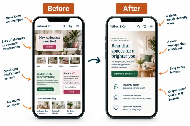
It’s easy to build and edit your WordPress website on a laptop, get everything looking just right and assume the job is done.
Then you open the same page on your phone.
The headline wraps awkwardly across five lines, the hero image takes over the screen and a button that looked perfectly positioned on desktop is suddenly difficult to find.
Responsive design allows your website to adapt to different screen sizes, but that doesn’t mean every design decision will automatically work well on mobile. It’s still important to check how your pages actually look and feel on smaller screens.
This matters for search visibility too. Google uses the mobile version of a site’s content for indexing and ranking through mobile-first indexing, so your mobile website shouldn’t be treated as a secondary version of your desktop design.
Check more than whether the page fits
Section titled Check more than whether the page fitsTesting your website on mobile isn’t just about making sure nothing falls off the edge of the screen.
Think about how somebody actually uses the page.
A desktop visitor has a large display, precise mouse pointer and plenty of room for navigation. Someone using a phone has much less space and is usually tapping elements with their fingers.
That means you should pay particular attention to:
- Text that becomes too small to read comfortably
- Headlines that take up most of the first screen
- Buttons and links that are difficult to tap
- Interactive elements positioned too close together
- Images that dominate the page unnecessarily
- Columns that stack in an awkward order
- Pop-ups that cover important content
- Navigation menus that become difficult to use
- Large gaps created by desktop spacing settings
A page doesn’t need to look exactly the same across every device. In fact, trying to preserve an identical desktop layout on a small screen can sometimes make the mobile experience worse.
The goal is to maintain the same content and purpose while presenting it in a way that works for the available space.
Pay attention to what visitors see first
Section titled Pay attention to what visitors see firstThe top of a page is particularly important on mobile because there is much less room available.
Imagine a desktop homepage with a large hero image, headline, paragraph and CTA sitting side by side. There may be enough space to see all four elements immediately.
Stack those elements vertically on a phone and the experience can be very different.
A huge image might push the headline or CTA much further down the page. Excessive padding can have the same effect.
Check the first screen of your most important pages and ask yourself:
- Can visitors quickly tell what this page is about?
- Is the most important information easy to spot?
- Can they find the primary action without excessive scrolling?
- Is anything taking up more space than it needs?
Sometimes the fix is as simple as reducing a heading size or adjusting the spacing around a section.
Make buttons easy to tap
Section titled Make buttons easy to tapButtons deserve some extra attention on smaller screens.
A desktop user can accurately click a fairly small link with a mouse. A mobile visitor has to tap it with their finger.
Buttons should therefore be large enough to use comfortably, with enough space around them to prevent someone accidentally tapping the wrong thing.
This becomes particularly important when several interactive elements appear close together, such as navigation links, form controls or multiple buttons.
It’s also worth checking the text inside your buttons. A CTA that fits neatly on one line on desktop might wrap awkwardly when space is limited.
Short, descriptive button labels generally work better.
Check how columns behave
Section titled Check how columns behaveMulti-column layouts are common in WordPress.
You might have three product cards side by side, an image next to some text or several features arranged across a row.
On smaller screens, those columns will usually stack vertically.
Check the order carefully.
For example, imagine a desktop page containing three rows where images and text alternate:
Image | Text
Text | Image
Image | Text
When those columns stack on mobile, you could accidentally end up with two images followed by two blocks of text. The desktop design looks intentional, while the mobile version becomes confusing.
Responsive settings in your theme or blocks may allow you to change the stacking behaviour. Even when they don’t, knowing how the layout behaves can help you structure the content differently.
Preview your WordPress pages on different screens
Section titled Preview your WordPress pages on different screensWordPress includes responsive preview tools that let you view your design at desktop, tablet and mobile widths while you work. You can also manually resize the editor canvas to check how the layout behaves between those preset sizes. The official WordPress responsive preview guide explains how to use these controls.
Use these previews throughout the design process rather than waiting until an entire page is finished.
But don’t rely on previews alone.
Open the finished page on your own phone and interact with it as a visitor would. Tap the menu, follow links, use forms, scroll through images and try your calls to action.
If possible, check more than one screen size too. A page that works beautifully on a large smartphone might still have problems on a narrower device or tablet.
TeamUpdraft already has a full guide to optimising WordPress for mobile covering responsive themes, layouts, images, database optimisation, navigation and performance.
Use this quick mobile design checklist
Section titled Use this quick mobile design checklistBefore publishing a new page, spend a few minutes checking the following:
- Read the page without zooming in
- Open and use the navigation menu
- Tap every important button
- Check that links aren’t positioned too closely together
- Make sure images fit the screen properly
- Look for headings with awkward line breaks
- Check that columns stack logically
- Test forms and input fields
- Check that pop-ups can be easily dismissed
- Make sure your primary CTA is easy to find
- Scroll through the entire page looking for unusually large gaps
You don’t need specialist equipment to catch many of the most common mobile design problems. A few minutes testing the page on your own phone can reveal issues that are easy to miss while working at a computer.
Don’t forget mobile performance
Section titled Don’t forget mobile performanceMobile design and performance also go hand in hand.
Large hero images, background videos and other visually impressive elements can add significant weight to a page. Their impact can be particularly noticeable for visitors using slower mobile connections.
Before adding a large visual element, ask whether it genuinely improves the page enough to justify the additional resources it requires.
Images can often be compressed and appropriately sized without making a noticeable difference to how they look. Lazy loading can also prevent images further down a page from loading before they’re needed.
Caching can help too. WP-Optimize includes page caching and can generate a separate cache for mobile devices when required, which can be useful when your site serves mobile-specific content.
We’ll look more closely at performance in Tip 5. For now, remember that a great mobile design should not only look good on a smaller screen. It should feel quick and easy to use too.
4. Make your navigation easier
Section titled 4. Make your navigation easier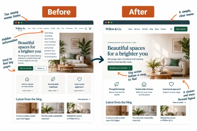
A visitor shouldn’t need to understand how your website is organised to find what they need.
Good navigation quietly guides people around your site. Visitors can find your products, services, contact information or useful content without having to stop and think about where it might be hiding.
As a WordPress site grows, though, navigation can become complicated surprisingly quickly. New pages get added to the menu, dropdowns gain more levels and important content ends up competing with pages that very few people actually need.
Simplifying your navigation can make your website feel easier to use almost immediately.
Keep your main menu focused
Section titled Keep your main menu focusedYour main navigation doesn’t need to contain a link to every page on your website.
Instead, prioritise the destinations that are most useful to your visitors.
Depending on the type of website you run, that might include:
- Products or services
- Pricing
- About
- Blog or resources
- Contact
- Account or login
Less important pages can usually live elsewhere. Privacy policies, terms and conditions and similar information, for example, are often better suited to the footer.
The goal is to make choices easier rather than giving visitors every possible option at once.
Dropdown menus can help organise larger websites, but be careful about adding too many layers. If someone has to open a menu, hover over another menu and then navigate through another submenu, finding a page starts to feel like work.
Group related pages together and keep the hierarchy as shallow as you reasonably can.
Use labels people immediately understand
Section titled Use labels people immediately understandCreative navigation labels can sound interesting, but clarity is usually more useful.
If a visitor wants to find your services, a menu item called “Services” immediately tells them where to go. Something vague like “Discover” could mean almost anything.
The same principle applies throughout your site.
Choose navigation labels that describe what visitors will actually find when they follow the link.
For example:
This doesn’t mean every website needs to use exactly the same labels. Your navigation should still reflect your brand and content. Just make sure personality isn’t getting in the way of understanding.
Make important actions easy to find
Section titled Make important actions easy to findYour navigation can also help draw attention to the action you most want visitors to take.
You might include a prominent button for:
- Start free trial
- Get a quote
- Book a demo
- View pricing
- Buy now
Try to keep this focused. Filling your navigation bar with several brightly coloured buttons brings you back to the same problem we discussed earlier, everything is competing for attention.
One clearly prioritised action is usually easier to understand.
Consistency matters here too. If “Get started” is your primary CTA in the navigation, but the same action is called “Join now”, “Sign up” and “Start today” elsewhere, consider whether those labels could be standardised.
Visitors should quickly learn what your important actions look like and what will happen when they select them.
Use internal links to guide the next step
Section titled Use internal links to guide the next stepNavigation isn’t limited to the menu at the top of your website.
Internal links within your content can help visitors naturally move from one useful page to another.
For example, someone reading an article about choosing a WordPress theme might benefit from a guide explaining how to test a WordPress theme before making it live. A visitor reading about WordPress performance could be directed towards a more detailed guide on caching or image optimisation.
These links are useful because they appear at the point where the visitor is most likely to need the additional information.
Use descriptive anchor text that explains where the link leads rather than generic phrases such as “click here” or “read more”.
For example, learn how to test a WordPress theme without going live gives the reader much more context than click here.
Internal linking can also help search engines understand the relationship between pages on your website, so improving it can support your wider site structure as well as helping human visitors navigate.
Don’t forget your footer
Section titled Don’t forget your footerThe footer gives you another opportunity to help visitors find their way around without overcrowding the main menu.
It can be a useful home for:
- Important secondary pages
- Contact information
- Help and documentation
- Social media links
- Legal pages
- Account links
- Key product or service categories
Avoid treating it as somewhere to dump every link that didn’t fit elsewhere, though.
Organise footer links into clear groups and use descriptive headings so visitors can scan them quickly.
A well-designed footer acts almost like a second navigation system, particularly for someone who has reached the end of a long page and is deciding where to go next.
Try the three-click navigation test
Section titled Try the three-click navigation testYou can get a surprisingly good sense of your navigation by pretending you have never seen your website before.
Choose three important things a typical visitor might want to do.
For example:
- Find the price of your main product
- Learn what your business offers
- Contact you with a question
Start from your homepage and try to complete each task.
Pay attention to how many decisions and clicks are required along the way.
There isn’t a strict rule that every piece of content must be reachable within exactly three clicks. What matters more is whether the journey feels logical and predictable.
If you find yourself wondering which menu item to choose, going backwards or opening several pages before finding the right one, your visitors may experience the same problem.
Check navigation on mobile too
Section titled Check navigation on mobile tooYour carefully organised desktop menu may look completely different when condensed into a mobile menu.
Open your site on a phone and check:
- Whether the menu is easy to open and close
- Whether menu labels are easy to read and tap
- Whether dropdowns are straightforward to expand
- Whether important links are still easy to find
- Whether the menu takes up an excessive amount of the screen
- Whether your primary CTA remains visible or accessible
This is particularly important if you have a large menu. What feels manageable across the width of a desktop screen can become a long list of links when displayed vertically on mobile.
You don’t necessarily need to rebuild your navigation from scratch. Removing a few unnecessary links, renaming an unclear menu item or reorganising one confusing dropdown
5. Make your website faster
Section titled 5. Make your website fasterA beautiful website can quickly lose its impact if visitors spend several seconds waiting for it to appear.
Performance might sound like a technical issue rather than a design decision, but the two are closely connected. Large images, videos, animations, custom fonts and complex layouts can all affect how quickly a page loads.
The good news is that you don’t necessarily have to sacrifice your design to make your WordPress site faster. Often, it’s about being more intentional with the elements you use and optimising what’s already there.
Start with your images
Section titled Start with your imagesImages are one of the easiest places to start because they can make up a significant portion of the data visitors need to download when opening a page.
Uploading a 5,000-pixel-wide photograph and displaying it in a 700-pixel-wide space, for example, means visitors could be downloading far more image data than they actually need.
Before uploading images to WordPress:
- Resize them to appropriate dimensions
- Compress them to reduce the file size
- Use modern image formats such as WebP or AVIF where appropriate
- Avoid uploading unnecessarily high-resolution images
- Think carefully about how many large images a page really needs
WordPress can generate multiple image sizes when you upload an image, which allows appropriately sized versions to be served in different situations.
You should also pay particular attention to the images visitors see immediately when a page loads. A huge hero image might look impressive, but if it significantly delays the rest of the page, it could be doing more harm than good.
If images are one of the biggest contributors to your page size, start there. Our complete guide to optimising images for WordPress walks through choosing the right format, resizing images and compressing them without unnecessarily sacrificing visual quality.
Lazy load content further down the page
Section titled Lazy load content further down the pageNot every image needs to load immediately.
If you have a long page containing 20 images, there is little benefit in making someone download all 20 before they have even scrolled past the first section.
Lazy loading delays certain off-screen resources until they are needed.
WordPress supports native lazy loading for many images, helping reduce the amount of content that needs to load initially.
Be careful with content at the top of the page, though. Important images that visitors see immediately generally shouldn’t be unnecessarily delayed.
The goal isn’t to lazy load everything. It’s to prioritise the resources visitors need first.
Be selective with fonts and visual effects
Section titled Be selective with fonts and visual effectsFonts can have a surprisingly noticeable effect on both design and performance.
It can be tempting to use several font families with multiple weights and styles, particularly when you’re trying to create more visual variety.
But each additional font file may mean another resource the browser has to load.
This is another reason why the simple typography system we discussed earlier can be useful. One or two carefully selected font families are usually enough to create hierarchy without introducing unnecessary complexity.
The same principle applies to visual effects.
Animations, background videos, sliders and interactive elements can make a page more engaging when they serve a clear purpose. Adding them simply because your page builder makes it possible can result in a site that feels busy and takes longer to load.
Before adding an effect, ask yourself whether it helps the visitor understand or use the page.
If the answer is no, the simpler option may be better for both design and performance.
Use caching to make pages load faster
Section titled Use caching to make pages load fasterWhen someone visits a WordPress page, the site may need to retrieve information, run PHP and assemble the page before sending it to their browser.
Caching can reduce the amount of work required by storing a ready-made version of the page and serving that to visitors instead.
For many WordPress sites, this can make a noticeable difference to loading times without requiring changes to the visible design.
A performance plugin such as WP-Optimize can help you manage page caching alongside other optimisation features from within WordPress.
WP-Optimize can also help with tasks such as image compression, database optimisation and minification, giving you several ways to improve performance without having to manage a collection of separate tools.
If your website serves different cached content to mobile visitors, WP-Optimize can also create a separate cache for mobile devices when required.
Keep your WordPress database tidy
Section titled Keep your WordPress database tidyOver time, your WordPress database can accumulate information you no longer need.
This might include things such as:
- Old post revisions
- Auto-draft posts
- Spam and trashed comments
- Expired transient options
- Other unnecessary database data
Cleaning this up won’t suddenly transform every slow website into a lightning-fast one, but regular database maintenance can be part of keeping a WordPress site healthy and efficient.
Before making significant database changes, create a backup of your website first. That gives you a way to restore your site if something unexpected happens.
WP-Optimize includes database cleaning tools and can show you which types of data are available to optimise, so you can review them before running a cleanup.
Test before and after you make changes
Section titled Test before and after you make changesOne of the best ways to improve performance is to measure it rather than guessing.
Google PageSpeed Insights can analyse a page and highlight potential performance problems. It also reports metrics related to Core Web Vitals.
Core Web Vitals focus on three important parts of the user experience:
These metrics are useful because they connect technical performance with experiences visitors can actually notice.
Cumulative Layout Shift is a particularly good example of the relationship between performance and web design. If an image suddenly loads and pushes a button down the page just as someone tries to tap it, that’s both a performance problem and a design problem.
Test an important page before making changes and record the results. Then optimise your images, caching or other problem areas and test it again.
This gives you a much clearer picture of whether your changes are actually improving the experience.
Don’t optimise away the personality
Section titled Don’t optimise away the personalityPerformance optimisation doesn’t mean your website needs to become a blank page with nothing but text.
Images, illustrations, video, animation and custom typography can all contribute to a memorable website.
The trick is deciding which elements earn their place.
Keep the visuals that strengthen your brand, explain something or improve the experience. Optimise them wherever possible and be more critical of elements that add extra weight without giving much back.
That principle ties all five of these WordPress web design tips together.
Good design isn’t about adding as much as possible. It’s about making deliberate choices so the elements that matter have the space, consistency and performance they need to work well.
5 quick WordPress design fixes at a glance
Section titled 5 quick WordPress design fixes at a glanceYou don’t need to tackle everything at once. If you only have an hour to improve your WordPress website, start with the area that currently causes the most friction and work from there.
Pick one important page, such as your homepage, most popular landing page or main product page, and work through these five checks.
You may be surprised by how different the page feels without changing your theme or rebuilding it from scratch.
Small changes can make a big difference
Section titled Small changes can make a big differenceImproving your WordPress web design doesn’t have to mean starting again.
Some of the most effective changes are relatively small. Give your content more breathing room, create consistent design rules, check your pages on mobile, simplify the way visitors navigate your site and make sure your design choices aren’t slowing everything down.
Most importantly, look at your website from your visitor’s perspective.
Can they understand what the page is about? Can they comfortably read it? Is it obvious where to go next? Does everything work just as well on their phone? Does the page load quickly enough that they actually stick around to see your carefully considered design?
If the answer to one of those questions is no, you’ve found a good place to start.
You don’t need to fix everything in one afternoon. Choose one of the five tips in this guide, improve an important page and compare the experience before and after. Then move on to the next.
Over time, those small improvements can add up to a WordPress website that looks better, feels easier to use and works harder for the people visiting it.
Give your WordPress site more than a design refresh
A great-looking WordPress website still needs the performance, security and reliability to back it up.
TeamUpdraft plugins can help you take care of the site behind the design, with tools for backups, performance optimisation, security, analytics and more.
FAQs
Section titled FAQsHow can I make my WordPress website look more professional?
Start by making your design more consistent. Use a limited colour palette, clear typography, consistent buttons and enough whitespace between elements.
Removing unnecessary content can also make a big difference. A simple page with a clear hierarchy will often feel more professional than one filled with competing design elements.
Can I redesign my WordPress site without starting again?
Yes. You can make substantial design improvements without rebuilding your WordPress website.
Try adjusting your typography, colours, spacing, navigation and individual page layouts first. If you use a block theme, WordPress Global Styles can also help you make site-wide design changes from one place.
If your current theme severely limits what you can change, you can consider switching themes later. Just make sure you test significant changes safely before applying them to your live site.
What makes a good WordPress website design?
A good WordPress website should be visually appealing but also easy to understand and use.
Clear hierarchy, readable typography, consistent styling, straightforward navigation, responsive layouts and good performance all contribute to the overall experience.
The best design decisions usually help visitors achieve something rather than existing purely for decoration.
How can I improve my WordPress website on mobile?
Start by opening your most important pages on an actual phone rather than relying entirely on the desktop editor.
Check your text sizes, buttons, menus, images, forms and the way columns stack. Make sure important information appears early enough on the page and watch for oversized elements or spacing that creates unnecessary scrolling.
WordPress responsive previews can help during the design process, but testing the finished page on a real device gives you a much better idea of how it feels to use.
Does website speed affect web design?
Yes. Performance is an important part of the overall website experience.
Large images, videos, animations, fonts and other design elements can increase the amount of data a visitor needs to download. A visually impressive page can still provide a poor experience if it takes too long to load or shifts around while someone is trying to use it.
Optimising images, using caching and being selective about resource-heavy design elements can help you balance appearance with performance.
Do I need a page builder to design a good WordPress website?
No. WordPress includes increasingly powerful design tools through the block editor and Site Editor, and many modern themes allow you to control layouts, colours, typography and other styles without installing a separate page builder.
Page builders can be useful if you need particular layouts or features, but they aren’t a requirement for creating an attractive WordPress website. Whichever approach you choose, focus on usability, consistency and performance rather than how many design options the tool gives you.
About the author

Mandy Kayat
Mandy is a versatile Freelance Writer and Digital Marketing Specialist with more than 8 years of experience. Mandy started her working life content writing for a major brand but has amassed tonnes of wide ranging experience since then, including project managing a full stack development team! From development to graphic design, video editing and social media management, Mandy’s broad expertise has made her an excellent addition to a growing marketing team.
Categories
UpdraftPlus
Get all our premium features. Direct site-to-site migration, incremental backups, back up automatically before updates and a whole lot more.
From just $70 for the year.
More stories
-

Best AI Website Builders Compared
AI website builders can help you design, write and launch a website in minutes. Compare the best AI-powered website builders based on ease of use, features, customisation, pricing and performance to find the right solution for your next project.
-

How incremental backups save time and storage in WordPress
Incremental backups only save the changes made since your last backup, helping you reduce storage usage, speed up backups and lower server load. Learn how they work and why they're an essential part of an efficient WordPress backup strategy.
-
Best WordPress Website Builders Compared
Discover the best WordPress website builders for every skill level. Compare features, ease of use, pricing and performance to choose the right builder for your blog, business or online store.
-
How to Schedule WordPress Backups
Learn how to schedule WordPress backups, choose the right frequency, and keep copies ready when you need to restore your site.